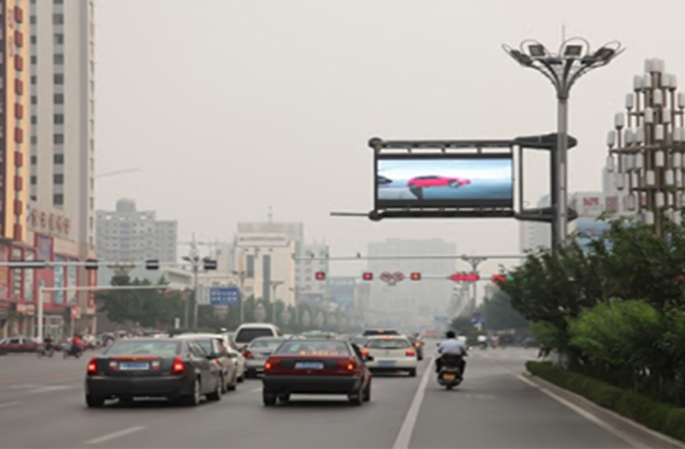
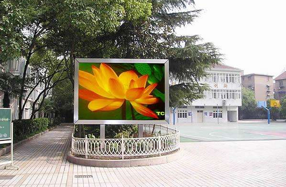
Quick answer: The best outdoor LED sign colors pair a very light color with a very dark color. Yellow on black, white on dark blue, black on yellow, and white on black are reliable starting points. However, no color is inherently anti-glare. Glare is controlled mainly by the screen surface, ambient light, brightness, viewing angle, and the luminance difference between the message and its background.
For maximum outdoor LED sign visibility, choose one dominant background, use one high-contrast text color, and test the message from the actual viewing distance in both direct sun and shade. Color should support readability, not compete with it.
Do Certain Colors Have Better Anti-Glare Properties for Outdoor Screen Visibility?
No. Colors do not have anti-glare properties by themselves. A yellow message may appear easier to see than a blue message in bright daylight because the eye is more sensitive to some wavelengths and because yellow often creates strong luminance contrast against black. That does not mean yellow removes reflections or glare.
Anti-glare performance comes from physical and operational factors, including:
- An anti-reflective or matte display surface
- A deep black level and sufficient daytime brightness
- An ambient light sensor that adjusts brightness automatically
- A screen angle that avoids direct reflections toward viewers
- A clean LED module face without dust, water spots, or protective-film haze
The practical rule is simple: optimize brightness contrast first, then choose color.
Best Outdoor LED Sign Colors for High Contrast
Use the table below to select outdoor LED sign colors with a large difference in perceived brightness.
| Text or Graphic | Background | Outdoor Use |
|---|---|---|
| Yellow | Black | Excellent for warnings, prices, and short calls to action |
| White | Black or dark blue | Excellent for general messages and longer copy |
| Black | Yellow or white | Excellent when the background can remain bright and uniform |
| White | Dark green | Good for directional, service, and informational messages |
| Dark blue | White or pale yellow | Good when a light background is appropriate |
These combinations work because their light and dark values are far apart. Hue alone is not enough. As a useful contrast baseline, the W3C explains a 4.5:1 contrast ratio for normal text and 3:1 for large text. Outdoor LED signs are not the same as web pages, but the principle is valuable: higher luminance contrast makes text easier to distinguish. In bright sunlight, field testing should be stricter than a desktop contrast check.
Outdoor LED Sign Colors to Avoid
Avoid pairs that have similar brightness, even when their hues look different in a design application. Common problem combinations include:
- Red text on blue, or blue text on red
- Green text on red, especially for viewers with color-vision deficiencies
- Orange on yellow
- Dark brown on black
- Pink on red
- Light gray on white
Highly saturated red and blue can also appear to vibrate at their edges. Thin strokes make this effect worse. If brand colors must be used together, separate them with a white or black outline and increase the font weight.
Why Contrast Matters for Outdoor LED Sign Colors
Outdoor readability depends on luminance contrast, which is the difference in perceived brightness between the foreground and background. Two different colors can still have nearly the same luminance. When that happens, the message blends into the background at a distance or under sunlight.
Good contrast improves three things:
- Recognition: viewers identify letters and symbols faster.
- Comprehension: short messages require less visual effort.
- Viewing distance: the message remains legible farther from the screen.
For traffic-facing or roadside content, viewers may have only a few seconds to read. A simple layout with strong light-dark separation is more effective than a complex palette.

How to Improve Outdoor LED Sign Visibility in Sunlight
- Start with a dark background. Black or deep blue usually produces the strongest perceived contrast with white or yellow text.
- Use bold, simple type. Choose a sans-serif font with thick strokes. Avoid thin, condensed, italic, or decorative lettering.
- Limit the message. Keep one idea per screen and remove unnecessary words. Short copy allows larger text.
- Set brightness for the environment. Use adequate brightness in daylight and automatic dimming at night. Excessive brightness after dark creates haloing and discomfort.
- Control reflections. Check the screen angle, protective cover, surface finish, and nearby reflective objects.
- Use outlines carefully. A thin white or black outline can separate brand colors, but heavy shadows and multiple borders reduce clarity.
- Test from the real viewing position. Review the sign at the intended distance, speed, angle, and time of day.
A Practical Outdoor LED Content Checklist
- One dominant background color
- One main text color with strong luminance contrast
- Large, bold letters sized for the viewing distance
- No critical meaning communicated by color alone
- No more than two or three colors on one message screen
- Enough on-screen time for the entire message to be read
- Daylight and nighttime brightness settings checked separately
- Reflections and glare checked from the viewer’s position
Frequently Asked Questions
Which outdoor LED sign colors work best together?
Black is the most versatile background because it creates strong contrast with white and yellow while reducing the amount of illuminated area. Dark blue can also work well when it supports the brand and the display maintains a deep black level.
Is yellow or white better for outdoor visibility?
Both can be highly visible on a dark background. Yellow is especially effective for short warnings, prices, and attention cues. White is often better for neutral information and longer messages. Choose the option that produces the clearest result on the actual display.
Does a brighter LED screen always reduce glare?
No. More brightness can overcome high ambient light during the day, but excessive output can create bloom, wash out fine details, and cause discomfort at night. Automatic brightness control is preferable to one fixed setting.
Should red and green be used together?
Avoid using red and green as the only way to separate text from its background or communicate status. Their luminance can be similar, and the combination is difficult for many people with color-vision deficiencies.
How can I test an outdoor LED sign before publishing content?
Preview the exact message on the installed screen, then observe it from the intended viewing distance and angle in direct sun, shade, dusk, and darkness. Check whether a first-time viewer can identify the main message within a few seconds.
Choose the Right Outdoor LED Display
Strong content design works best when the display can deliver adequate brightness, uniform color, a stable black level, and automatic control. Explore our outdoor full-color LED display screens, or contact LED Controller Card for help matching an outdoor screen to its viewing distance and environment.